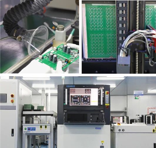
Effective quality dashboard design transforms raw manufacturing data into actionable insights, allowing buyers to monitor production health without being on the factory floor. Instead of relying on reactive weekly reports, a well-structured dashboard provides real-time visibility into yield rates, defect trends, and process stability. This guide outlines the critical specifications, risks, and validation steps necessary to implement or request a robust quality monitoring system from your electronics manufacturing partner.
Key Takeaways
- Real-Time Visibility: Move from static spreadsheets to dynamic feeds that track First Pass Yield (FPY) and defect density instantly.
- Traceability: Ensure every data point links back to specific serial numbers, lot codes, and operator IDs.
- Actionable Alerts: Define triggers for Statistical Process Control (SPC) violations to prevent mass defects.
- Incoming Quality Control (IQC): Tracking raw material compliance, component date codes, and vendor performance.
- Process Monitoring: Real-time data from surface mount technology (SMT) lines, including reflow oven profiles and pick-and-place accuracy.
- Test Results: Aggregated pass/fail data from functional testing (FCT) and flying probe tests.
Contents
- Quality Dashboard Design: Scope, Decision Context, and Success Criteria
- Specifications to Define Upfront (Before You Commit)
- Key Risks (Root Causes, Early Detection, Prevention)
- Validation & Acceptance (Tests and Pass Criteria)
- Supplier Qualification Checklist (RFQ, Audit, Traceability)
- How to Choose Quality Dashboard Design (Trade-Offs and Decision Rules)
- FAQ (Cost, Lead Time, DFM Files, Materials, Testing)
- Request a Quote / DFM Review for Quality Dashboard Design (What to Send)
- Glossary (Key Terms)
- Conclusion (Next Steps)
Quality Dashboard Design: Scope, Decision Context, and Success Criteria
In the context of Printed Circuit Board Assembly (PCBA) and electronics manufacturing, a quality dashboard is the visual interface of the Manufacturing Execution System (MES). It aggregates data from various stages of production to answer one fundamental question: "Is the product being built to specification?"
Scope of the Dashboard
A comprehensive quality dashboard must cover the entire lifecycle of the manufacturing batch. It should not be limited to final inspection. The scope includes:
- Incoming Quality Control (IQC): Tracking raw material compliance, component date codes, and vendor performance.
- Process Monitoring: Real-time data from surface mount technology (SMT) lines, including reflow oven profiles and pick-and-place accuracy.
- Test Results: Aggregated pass/fail data from functional testing (FCT) and flying probe tests.
- Out-of-Box Audit (OBA): Results from the final random inspection before shipment.
Decision Context
Buyers and program managers use these dashboards to make critical decisions regarding lot release and supply chain management.
- Stop-Ship Decisions: If the dashboard shows a spike in critical defects at the AOI stage, the buyer can halt the line before value-added processes (like conformal coating) are applied.
- Supplier Evaluation: Long-term trend analysis helps in evaluating whether a contract manufacturer (CM) is improving or degrading in quality over time.
- Root Cause Analysis: When a field failure occurs, the dashboard allows engineers to drill down into the specific production history of the failed unit.
Success Criteria
To evaluate if a quality dashboard design is successful, measure it against these criteria:
- Latency: Data should appear on the dashboard within seconds or minutes of the event, not days.
- Granularity: Users must be able to switch between high-level batch views and individual serial number histories.
- Clarity: The design must prioritize "management by exception," highlighting issues that require immediate attention rather than cluttering the screen with nominal data.
Specifications to Define Upfront (Before You Commit)
Defining the specifications for your quality dashboard is as critical as defining the specs for the PCB itself. If you do not specify the data requirements, you will likely receive a generic, high-level summary that lacks actionable depth.
Data Source Integration
The dashboard must pull data directly from the machines to avoid human error.
- SPI Data: Volume, area, and height of solder paste deposits.
- Reflow Profiling: Time-temperature curves for every board (if continuous monitoring is available).
- AOI/AXI: Image links to defects, false call rates, and component shifting data.
- ICT/FCT: Parametric test data (voltage, current, resistance readings), not just Pass/Fail status.
Visualization and Metrics
Specify exactly which Key Performance Indicators (KPIs) must be displayed.
| Metric Category | Specific KPI | Visualization Type | Purpose |
|---|---|---|---|
| Yield | First Pass Yield (FPY) | Line Chart (Time Series) | Tracks process efficiency without rework. |
| Defects | DPMO (Defects Per Million Opportunities) | Bar Chart (Pareto) | Identifies the most frequent defect types. |
| Stability | Cpk (Process Capability Index) | Histogram / Bell Curve | Measures if the process is centered within limits. |
| Throughput | Units Per Hour (UPH) | Gauge / Counter | Monitors production speed against targets. |
| Traceability | WIP (Work In Progress) Status | Sankey Diagram / List | Shows where inventory is stuck in the line. |
User Access and Hierarchy
- Executive View: High-level yield, total output, and critical alerts.
- Engineering View: Parametric data, spc chart setup details, and log files.
- Operator View: Immediate station performance and consecutive fail alerts.
Alerting Mechanisms
The design must include active notifications.
- Consecutive Failure Trigger: If 3 boards fail sequentially at the same station, trigger an alarm.
- Yield Drop Trigger: If FPY drops below 95% in a rolling hour, notify the line lead.
- Parameter Drift: If test values approach the control limits (even if passing), flag for preventative maintenance.
Related resources
Key Risks (Root Causes, Early Detection, Prevention)
Implementing a quality dashboard involves technical and operational risks. Poor design can lead to data overload or, worse, a false sense of security.
1. Data Latency and Synchronization
- Risk: The dashboard displays data with a 24-hour lag.
- Root Cause: Batch processing of logs instead of real-time API connections.
- Impact: Defective units are produced for a full shift before the issue is detected.
- Prevention: Require API-based or MQTT-based data transmission. Validate latency during the pilot phase.
2. "Garbage in, Garbage Out" (Data Integrity)
- Risk: The dashboard shows 99% yield, but customers report failures.
- Root Cause: Operators manually scanning "Pass" for failed boards to keep the line moving, or testing limits set too wide.
- Impact: Loss of trust in the system; shipment of bad product.
- Prevention: Implement machine interlocking (the conveyor stops if the board fails). Use automated data collection exclusively where possible.
3. Alarm Fatigue
- Risk: Users ignore alerts because there are too many.
- Root Cause: Setting control limits too tight or flagging non-critical deviations.
- Impact: Critical failures are missed amidst the noise.
- Prevention: Tune the spc chart setup carefully. Use Western Electric rules to identify genuine statistical anomalies rather than random noise.
4. Lack of Drill-Down Capability
- Risk: You see a yield drop but cannot identify why.
- Root Cause: Dashboard aggregates data but disconnects it from the raw log files or serial numbers.
- Impact: Increased downtime while engineers manually hunt for logs.
- Prevention: Ensure every data point on a chart is clickable and links to the underlying raw data.

Validation & Acceptance (Tests and Pass Criteria)
| Test / Check | Method | Pass criteria (example) | Evidence |
|---|---|---|---|
| Electrical continuity | Flying probe / fixture | 100% nets tested; no opens/shorts | E-test report |
| Critical dimensions | Measurement | Meets drawing tolerances | Inspection record |
| Plating / fill integrity | Microsection | No voids/cracks beyond IPC limits | Microsection photos |
| Solderability | Wetting test | Acceptable wetting; no de-wet | Solderability report |
| Warpage | Flatness measurement | Within spec (e.g., ≤0.75%) | Warpage record |
| Functional validation | FCT | All cases pass; log stored | FCT logs |
Before relying on the dashboard for production decisions, it must undergo rigorous validation. This ensures the digital twin matches the physical reality of the factory floor.
Data Integrity Testing
- Test: Manually induce a defect (e.g., a short circuit) on a test board and run it through the line.
- Pass Criteria: The dashboard must reflect the failure with the correct error code, location, and timestamp within the specified latency period (e.g., < 30 seconds).
Stress Testing
- Test: Simulate maximum production volume (e.g., all lines running at full speed) to check data ingestion rates.
- Pass Criteria: No data loss, no dashboard freezing, and report generation time remains under 5 seconds.
Traceability Audit
- Test: Select a random serial number from a finished goods box.
- Pass Criteria: The dashboard must retrieve the full history:
- Solder paste height data.
- Reflow oven profile used.
- AOI images of the board.
- ICT test values.
- Rework history (if any).
User Acceptance Testing (Uat)
- Test: Ask a quality engineer to identify the top 3 defect types for the past week using the dashboard.
- Pass Criteria: The engineer can locate this information within 3 clicks and 2 minutes.
Supplier Qualification Checklist (RFQ, Audit, Traceability)
When selecting a PCB manufacturer, their ability to provide a transparent quality dashboard is a key differentiator. Use this checklist during the Request for Quote (RFQ) and audit phases.
RFQ Phase Questions
- MES Capabilities: Do you have a centralized Manufacturing Execution System? What platform is it based on?
- Data Access: Can you provide a secure portal for us to view real-time quality data?
- Standard Reports: Provide examples of your standard yield and Pareto charts.
- Customization: Can we define custom spc chart setup parameters for our critical features?
On-Site Audit Checks
- Barcode Scanning: Observe if operators scan every board at every station. Verify that the scan triggers the correct machine program.
- Interlocking: Ask the operator what happens if a board fails AOI. Does the conveyor automatically divert it? Does the system prevent it from entering the next machine?
- Visual Management: Look for monitors on the production floor. Do they match the data shown in the central office?
- Rework Logging: Watch a rework station. Is the repair action logged digitally against the serial number, or is it written on paper?
Traceability Requirements
Ensure the supplier can link the following to the dashboard:
- Material Traceability: Lot codes of capacitors, resistors, and ICs used on a specific board.
- Process Traceability: Machine ID, Feeder ID, and Stencil ID.
- Human Traceability: Which operator performed the visual inspection or assembly task.
For more on how quality systems are integrated into manufacturing, review our Quality System overview.
How to Choose Quality Dashboard Design (Trade-Offs and Decision Rules)
There is no one-size-fits-all dashboard. The right design depends on your volume, product complexity, and budget.
1. Standard vs. Custom Dashboards
- Standard: Most EMS providers offer a standard web portal.
- Pros: Free or low cost, immediate availability, tested stability.
- Cons: Limited metrics, generic layout, may not track specific parametric data.
- Decision Rule: Use standard for low-complexity, consumer-grade electronics.
- Custom: Built specifically for your product using tools like PowerBI, Tableau, or custom SQL queries.
- Pros: Tracks exactly what you need (e.g., specific RF performance metrics), tailored alerts.
- Cons: High NRE (Non-Recurring Engineering) cost, requires maintenance.
- Decision Rule: Essential for automotive, medical, or aerospace products where liability is high.
2. Cloud vs. On-Premise Data
- Cloud: Data is hosted on AWS/Azure.
- Pros: Accessible from anywhere, scalable storage.
- Cons: Security concerns regarding IP, potential latency.
- On-Premise: Data stays on the factory's local server; accessed via VPN.
- Pros: Maximum security, high speed within the factory.
- Cons: Difficult for remote buyers to access, requires IT support.
- Decision Rule: Choose cloud for global supply chains; choose on-premise (with secure tunnel) for defense/ITAR projects.
3. Real-Time vs. Periodic Reporting
- Real-Time: Live streaming of data.
- Trade-off: Requires high bandwidth and sophisticated MES integration. Can lead to micromanagement.
- Periodic (Daily/Shift): Data uploaded in batches.
- Trade-off: Easier to implement. Risk of delayed reaction to quality excursions.
- Decision Rule: Real-time is mandatory for high-volume automated lines. Periodic is acceptable for high-mix, low-volume manual assembly.
4. Depth vs. Usability
- High Depth: Every single parametric test value is logged.
- Trade-off: Massive database size, slow query speeds, hard to read.
- High Usability: Aggregated Pass/Fail data only.
- Trade-off: Fast and clean, but impossible to debug marginal failures.
- Decision Rule: Design a tiered dashboard. The top layer is high usability; the drill-down layer offers high depth.

FAQ (Cost, Lead Time, DFM Files, Materials, Testing)
What Is the Typical Cost to Implement a Custom Quality Dashboard?
Costs vary significantly based on complexity. A standard portal access is often included in the manufacturing service. Custom development involving API integration and specific spc chart setup can range from $2,000 to $10,000 in NRE, plus potential monthly maintenance fees for data storage.
How Does Design for Manufacturability (DFM) Affect Dashboard Metrics?
Good DFM reduces the noise in your dashboard. If a design is marginal (e.g., pads too small), you will see constant false calls at AOI and lower FPY. Reviewing DFM Guidelines helps optimize the design so that dashboard alerts indicate real process issues, not design limitations.
Can I Integrate the Manufacturer's Dashboard with My Own Erp?
Yes, this is often done via API (REST/JSON) or EDI. You can pull shipment and yield data directly into your SAP or Oracle system. However, this requires cooperation from the manufacturer's IT team and usually involves a setup fee and security audit.
How Long Should Quality Data Be Retained?
For consumer electronics, 1-2 years is standard. For automotive, medical, and aerospace, retention requirements often range from 7 to 15 years. Ensure your dashboard agreement specifies the retention period and the format for data archiving.
Does the Dashboard Track Component-Level Failures?
A robust dashboard should track failures down to the reference designator (e.g., C12, U4). This allows you to see if a specific component location is failing frequently, indicating a potential design or footprint issue rather than a random process defect.
What Is an "MES Traceability Tutorial" in This Context?
It refers to the training or documentation provided to engineers on how to use the Manufacturing Execution System to trace a product's history. It covers how to query the database using serial numbers to find which batch of solder paste was used or which operator assembled the unit.
Can the Dashboard Monitor "Soft" Failures?
Yes. Soft failures are units that pass but are close to the limit. By using Cpk and Cp metrics, the dashboard can highlight processes that are drifting toward failure before they actually produce bad parts. This is the core value of predictive quality monitoring.
Request a Quote / DFM Review for Quality Dashboard Design (What to Send)
Contents
- Quality Dashboard Design: Scope, Decision Context, and Success Criteria
- Specifications to Define Upfront (Before You Commit)
- Key Risks (Root Causes, Early Detection, Prevention)
- Validation & Acceptance (Tests and Pass Criteria)
- Supplier Qualification Checklist (RFQ, Audit, Traceability)
- How to Choose Quality Dashboard Design (Trade-Offs and Decision Rules)
- FAQ (Cost, Lead Time, DFM Files, Materials, Testing)
- Request a Quote / DFM Review for Quality Dashboard Design (What to Send)
- Glossary (Key Terms)
- Conclusion (Next Steps)
Contents
- [quality dashboard design: scope, decision context, and success criteria](#quality-dashboard-design-scope-decision-context-and-success-cr...
- Specifications to define upfront (before you commit)
- Key risks (root causes, early detection, prevention)
- quality dashboard design: scope, decision context, and success criteria
- Specifications to define upfront (before you commit)
- Key risks (root causes, early detection, prevention)
- Validation & acceptance (tests and pass criteria)
- Supplier qualification checklist (RFQ, audit, traceability)
- How to choose quality dashboard design (trade-offs and decision rules)
- FAQ (cost, lead time, DFM files, materials, testing)
- Request a quote / DFM review for quality dashboard design (what to send)
- Conclusion (next steps)
Glossary (Key Terms)
| Term | Meaning | Why it matters in practice |
|---|---|---|
| DFM | Design for Manufacturability: layout rules that reduce defects. | Prevents rework, delays, and hidden cost. |
| AOI | Automated Optical Inspection used to find solder/assembly defects. | Improves coverage and catches early escapes. |
| ICT | In-Circuit Test that probes nets to verify opens/shorts/values. | Fast structural test for volume builds. |
| FCT | Functional Circuit Test that powers the board and checks behavior. | Validates real function under load. |
| Flying Probe | Fixtureless electrical test using moving probes on pads. | Good for prototypes and low/medium volume. |
| Netlist | Connectivity definition used to compare design vs manufactured PCB. | Catches opens/shorts before assembly. |
| Stackup | Layer build with cores/prepreg, copper weights, and thickness. | Drives impedance, warpage, and reliability. |
| Impedance | Controlled trace behavior for high-speed/RF signals (e.g., 50Ω). | Avoids reflections and signal integrity failures. |
| ENIG | Electroless Nickel Immersion Gold surface finish. | Balances solderability and flatness; watch nickel thickness. |
| OSP | Organic Solderability Preservative surface finish. | Low cost; sensitive to handling and multiple reflows. |
Conclusion (Next Steps)
A well-executed quality dashboard design is not just a reporting tool; it is a control tower for your supply chain. It provides the transparency needed to trust your manufacturer while verifying their performance. By defining your specifications for granularity, latency, and metrics upfront, you prevent the risks of data silos and alarm fatigue.
To ensure your next project benefits from full transparency and rigorous quality control, start by validating your design and discussing data requirements early. Contact our engineering team to discuss how our AOI Inspection and MES capabilities can be integrated into your quality monitoring strategy.
Next Steps:
- Audit your current visibility into production.
- Define your critical-to-quality (CTQ) metrics.
- Contact us to schedule a demo of our traceability systems and quality reporting capabilities.
